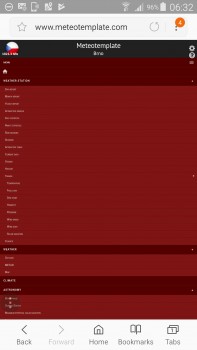
Hi, in both portrait and landscape it looks fine on Android, namely my Note 3, using Chrome and Samsung browsers, but,
As you know, there is the issue when you choose to view the normal site, it was also found to be the same on numerous
devices.
It is kind of a biggy, folks have these big phones and other mobile devices so that they can take their pc on the move so
to speak, they prefer to look at the main sites (well, i do) because mobile sites are just a small cut down of the desktop
version and do not offer all, actually, very limited information.
If after you have tried clicking the desktop icon and you then try the browsers, request desktop site, it changes back to
mobile with the menus all out.
If you do not know about the desktop icon at the bottom and use the browsers, request desktop site, again, that just
refreshes the mobile site and opens all the menus.
The only way i have managed to get it to work on my site is by adding a desktop redirect link, even still, thats not 100%
But it is 80% better, I still then have to click the browsers, request desktop site if i want to view it 100% as desktop.


If you have an android phone Jachym, you can emulate iphone browser
click here to show you how
couple of images down and you will see, its a small hack using the standard browser


